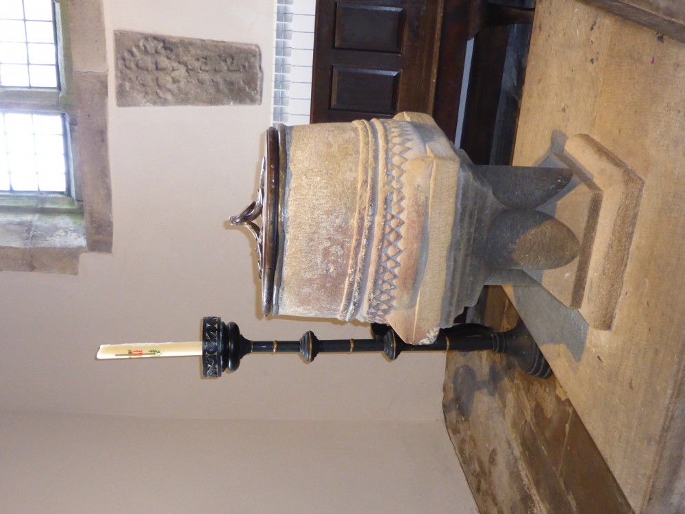
The Fonts
The old font, now used as a flower planter, was removed from the church during the 1880 refurbishment, when the current Norman font was reinstated. It has an unusual seven sided top band and is carved from coarse sandstone, of a type found locally, but is difficult to date. The present church building dates from the 15th Century and it could be that the disused font also dates from then. The Rev Baron suggested it to be 17th Century, when major work was carried out to the interior of the church, and 18th Century Vestry Minutes dated 13 April 1766 record consent being granted for the removal of the font, but this could just refer to its repositioning.

The older font which now stands in the Baptistry is most probably Norman and was put in position when the Baptistry was relocated to the area originally used as the vestry, when the church was refurbished in 1880. This font may have been removed during the Reformation or a later refurbishment, and is variously reported to have been rescued from a garden rubbish dump; from use as a pig trough; or in the building trade for slaking lime or to contain workmen’s fires! It is unlike any similarly dated fonts in the area and it's form suggests it to have been originally part of a Norman pillar.
Harriet M. Sonne de Torrens of the Baptisteria Sacra (an Iconographic Index of Baptismal Fonts), University of Toronto, has made some observations based on photographs and dimensions of the Kirkby Malham font:
“There are several curious features about your baptismal font. Medieval fonts, whether Norman or later, are typically one meter high. If the font itself was shorter, a plinth would be added to create what was considered the "ideal height". The basic design of your font does not suggest that it was once supported by four columns, a central shaft or a barrel shaped base. The carved lower edge suggests that it once stood directly on the ground which would have been too short for a font.
This immediately makes me ask if it originally had another purpose before being used as a baptismal font. Because of the size and the design of the lower base was it perhaps intended first as a capital or lower portion of a column and then converted at some point? The finely carved spurs (they appear to have been retouched - normally spurs over 800 years display wear) on each of the corners is a feature often found on the lower bases of the famous Tournai (France) fonts and on the lower bases of columns. Certainly the zig-zagged lower edging, also called the dog-tooth motif, is a Norman feature. The combination of the two on a Norman font is unique."
Some small, many layered, spots of whitewash can still be seen in places, these and the pinkish discolouration of the stone may tie in with the fonts alleged previous uses in the building trade for slaking lime or for containing fires.
No original base was found and the present pedestal dates from the building’s Victorian restoration. The oak and wrought iron font cover is a late 20th century addition, made by the local artist and blacksmith Bill Wild.